 |
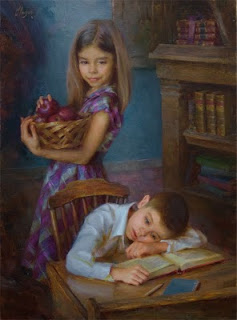
Encouraging Gesture
Oil • 22" x 30" |
Hi everyone! Remember that painting demonstration I began two eons ago and never completed? Well, I've finally finished it! Yes, folks, your eyes do not deceive you... it's Stage 12!
Please accept my humble apologies for taking much longer to finish than the 1-to-2-week estimate I gave in Stage 11. I was tempted to deem the picture "finished" a while ago, but I'm glad I kept working on it, because now the painting is much closer to my original vision. The completed painting, which I've titled "Encouraging Gesture," is to the right.
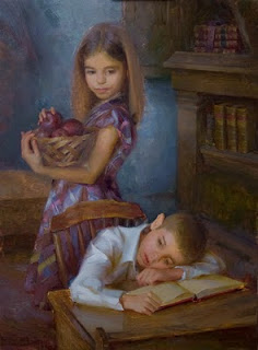
As I promised in Stage 11, this post has lots of pictures showing "before and after" versions of each area I've reworked since last time (which, ironically, is just about
every area!). You see, I strove to keep this demo concise by covering as much canvas as I could in each stage. As a result, I left many areas unfinished. Since last time, however, I've touched-up, reworked and, in some cases, completely repainted these unfinished parts. My alterations are shown below with text explaining my decisions. Let me say, this post is bigger than a hippo on Twinkies. It's so large, in fact, that I decided to break it up into two parts. I'll post the second part tomorrow. Remember, you can click any image to view it in high-resolution. Enjoy!
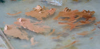
 |
| Before |
|
| After |
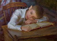
Jackson and Desktop
 |
| Before |
 |
| After |
Although it may not be evident at first glance, the above "Before" and "After" stages represent a lot of rework. Jackson is my painting's main "focal point" or "center of interest." This means he is the most important element in the picture. I chose to do this way back in Stage 1. Now, don't get me wrong, Sydney is equally important to my story. But if two elements in a picture are allowed to compete for attention, the painting is usually weakened (No offense, Sydney! I'll make you most important in another painting if you're willing to pose for me again!). I made Jackson the center of interest by reserving the lightest values of the piece for his skin and shirt. This draws the viewer's eyes to him and makes him "pop" forward. The very lightest value of all was reserved for the highlight of the collar. This helped to direct attention to Jackson's face. To make the collar highlight bright enough, I actually darkened parts of the sleeve. If you squint at the two images above, you'll see the difference. I had to bring the sleeve to a more finished state anyway, so I just darkened it a bit while I was at it.
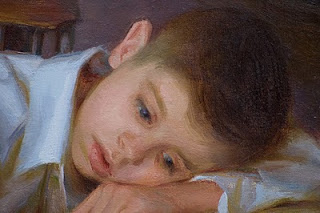
Well, I almost completely repainted the little guy's noggin. Jackson's head was very challenging for me because the value and temperature shifts within the light side were extremely subtle. It was also difficult because I wanted to deviate from my reference photo by making the cheek highlight the lightest value of the face. By doing this, I was able to give a slightly stronger sense of spherical form to the head and, therefore, make it more life-like.
As I began the repainting of Jackson's head, I first mixed up five piles of flesh colors, each a different value. Mixing up plenty of paint beforehand always makes things easier. From each color pile, I extended a "trail" of paint. Into these trails, I mixed cooler and warmer variations of the original color. By doing this, I preserved part of the original pile of color for future use. Mixing an array of colors ahead of time allows the artist to compare each hue next to each other on the palette before placing it on the canvas. A picture of my palette during this stage is above.
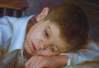
Once I mixed my basic flesh color piles, I blocked-in Jackson's face again. You'll notice in the photo to the left that all my shapes have sharp outer edges. This is because the value and temperature choices were so difficult (for me), that I could not concentrate on correct edge-work simultaneously. After I established an accurate groundwork of values and temperatures, I softened my edges and added a few touches of more vibrant color. Here's a tip: I find that I can achieve a "looser" look if I add a transitional tone to soften an edge instead of simply blending it with a clean brush. Nevertheless, remember that brushwork variety is important.
If you're an aspiring painter who gets discouraged when you find you must repaint an area of a picture, take heart! This is completely normal. Sargent himself was said to have sometimes repainted heads over 15 times before he got them right (illustrator James Gurney has a great post about this at his blog
here). If Sargent was not exempt from painting struggles, we have no reason to be discouraged when we have difficulties. I hope that's as much of an encouragement to you as it is to me!
I bet you were wondering when on earth I would finish that lower hand! Until this stage, I had left it in a state of block-in limbo.
The book's pages got a makeover, namely with a sharper edge between their top and side planes. This gave the pages a little more solidity. I also tried to improve the overall color and added "words" (Hint: never try to actually paint tiny things like book text and eyelashes. Instead, paint the overall
impression of what you see). Finally, I cast a subtle shadow over the right-most corner of the book to prevent it from directing the viewer's eye out of the canvas like an arrow. Sorry, you'll have to scroll up to the un-cropped image to fully see this change.
I added a notebook and pencil to the desktop for three reasons: 1) I did not want the blue wall in the background to be the only area where that color occurred. 2) I thought the value shape of the desktop was too uniform and needed to be "broken up" by other elements. 3) I wanted to reveal the raised back edge of the desk more clearly.
That's all for now, folks! Tune in tomorrow for images and discussion of my changes to Sydney and the background. Have a great night!


