

Do you find it difficult to mix good skin colors?
Before you try to mix the color of a shape, you must first consider that shape's value and temperature (For value, see Making Your Flat Portraits Look 3-D. For temperature, see Avoiding Muddy & Chalky Skin Tones.)
But this lesson is about color. So without further ado, here is My Simple Method for Mixing Any Skin Color…
Step 1: Simplify
Flesh can contain hints of every color of the rainbow! When I'm mixing skin colors, I often find myself dipping into every color on my palette.
This is why I find it best to keep things simple in the beginning. When I start mixing skin colors, I think of each color on my palette as belonging to 1 of 3 categories:
- Reds
- Yellows
- "Nudge Colors" (I'll define this in a sec)
I find that simplifying my colors like this is an efficient approach to painting any skin color under almost any condition.
Of course, there are
always exceptions
Let's say you're feeling adventurous, and you light your model with a bright blue LED light. Your model's skin tones will just look blue, without much influence of red or yellow. But under typical lighting conditions, your model's skin colors will contain some balance of red, yellow, and a nudge color.
Step 2:
Mix Up Big Piles
of Average Colors
Now, by "average" colors, I mean colors that generally represent the colors in the subject as simply as possible. I know you can see dozens of colors in your subject. But in the beginning, keep things simple and don't try to match every color you see right away. You can mix more specific colors later with those "nudge colors" I'll talk about.

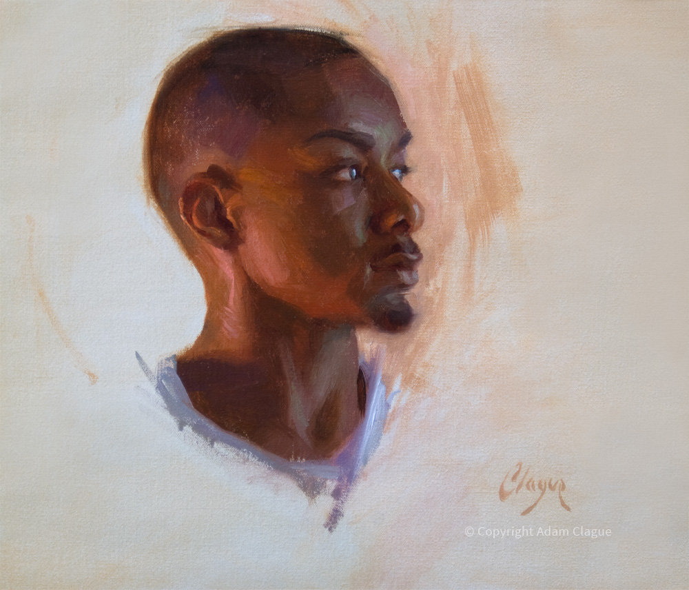
At the start, I mix up just 2 big piles of average color–1 average color for the lit side of the head and 1 average color for the shadowed side (above, you can see these two colors applied in broad, blocky shapes).
Step 3:
Nudge as Needed
First of all, just what is a "nudge color" anyway?
Well, mixing just red and yellow together can produce some pretty intense oranges that may not look natural as flesh colors. For this reason, it's usually necessary to "nudge" your mixture toward one color or another by mixing in other color(s)–"nudge colors."
Below are a 2 examples of average color mixtures I often start out with. In both cases, white is used as a nudge color. The white both lightens and cools the original orange color.
Example 1: Lemon, permanent alizarin crimson & white.

Example 2: Yellow ochre, permanent red medium & white.

Now, although I often start with the above mixtures, I certainly also mix in various other nudge colors as necessary. Sometimes your subject will dictate a nudge toward green in places. Or blue. Or violet. In fact, Any other color on your palette is a candidate for a nudge color.

So, How Do I Know Which
Reds, Yellows and Nudge Colors to Use?
Excellent question. My best answer is let your subject be your guide. Choose colors that are appropriate for the values, temperatures and colors in the subject.
In the end, observe your subject with care and faithfully paint the colors you see before you. Formulas only help you know what to look for and prepare you for what you might find–nothing more. Much more important than any formula is the process of training your eye to observe and paint faithfully.
If you found this lesson valuable, you'll enjoy digging even deeper in the online video course. Access to the course will be available for purchase starting October 7, 2019, but you can start today for FREE! Click the button below for details.
|
I hope you've enjoyed these lessons on painting the portrait! In the next lesson, I'll kick off an exploration of figure painting with The 4 Actions for Accurate Proportions.
See you then!
—Adam