Do you struggle to create figures that look dynamic and not stiff? Maybe you've applied those 4 Actions for Accurate Proportions, and have measured and re-measured. Everything seems to be accurate. And yet, in your drawing, the figure still looks stiff as a board!
The 4 Actions can indeed help you achieve accuracy. But accuracy and liveliness are sometimes 2 different things. At the end of the last lesson, I mentioned there is actually kind of a 5th action—the gesture line.
Practicing gesture lines is a key to creating figures that look dynamic and not stiff.
What Gesture Lines Are
And Why You Need Them
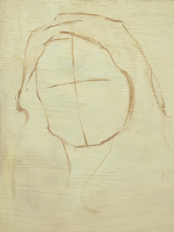
"Gesture lines" are simply lines that communicate the implied movement or "rhythm" of a person's pose (see the examples below).


Even when a person is holding still, the human body naturally tends to have graceful, flowing lines that imply movement. This implied movement is what the gesture line does a great job of capturing.
Typically, gesture drawing is done from life, and under a short time limit. Each example above represents about 2–3 minutes of drawing. Below, I've spent just a couple more minutes on each drawing (click images to enlarge).


In the extra time spent on each drawing, I simply built more specific shapes on top of my original gesture lines. If you use your initial gesture lines as the foundation for a drawing, they can help your drawing retain some of the energy of those gesture lines.
But your drawing will only be as strong as your foundation. That's why—even when you're gesture drawing—you still need to apply the 4 Actions for Accurate Proportions. Because of the limited time-frame of a gesture drawing session, it's impractical to hold up a measuring tool for every mark. However, you still have to apply the 4 Actions using your eye.
How This Applies
To You as a Painter
You might be thinking, "That's great for drawing, but I want to paint." Well, it's a funny thing—a disciplined practice of gesture drawing can lead to a command of the gesture line, which in turn can help your figure paintings look more dynamic. I'm not 100% sure why this is the case, but I think it may go something like this:
- Gesture drawing can give you familiarity with (and therefore greater confidence in) drawing the basic shapes of the human figure.
- This confidence can help you break free from a slavish adherence to static photo references when painting a studio work.
- With practice, the energy and liveliness of gesture drawing can be wielded in harmony with the objectivity of the 4 Actions to create figures that are both accurate and artistic.
Dig Deeper in the
Online Video Course!

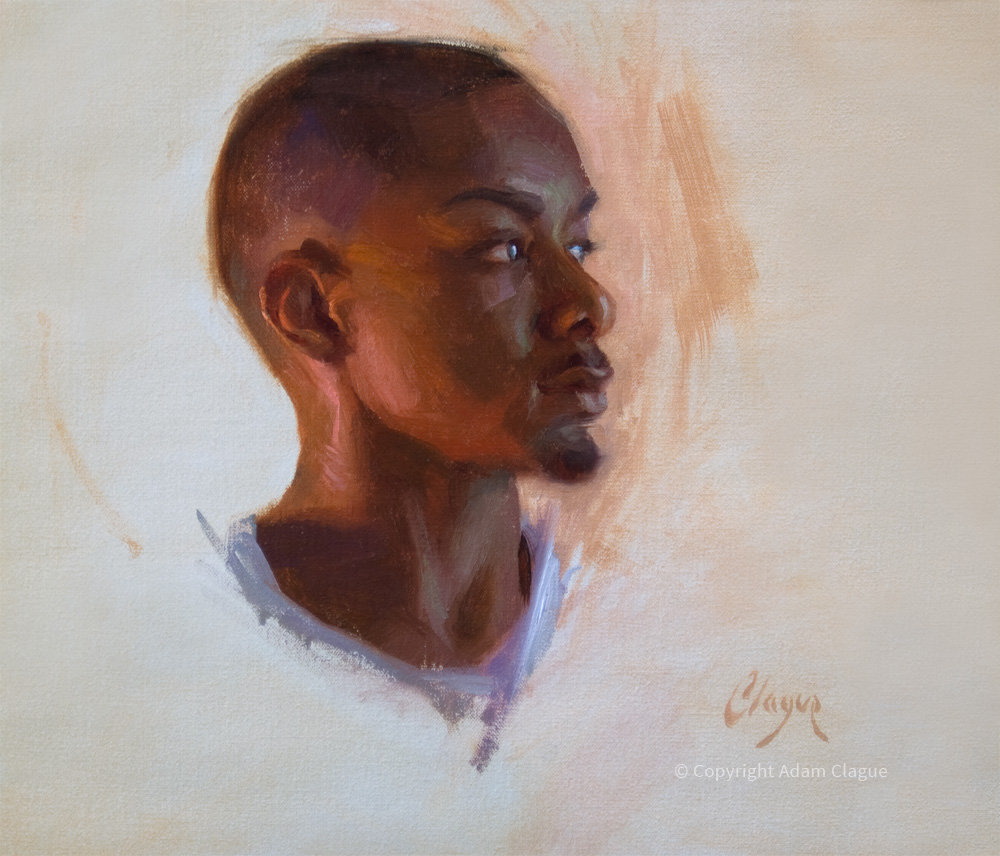
(Click image to view full-size)
If you found this Free Art Lesson valuable, you'll enjoy digging even deeper in the online video course, Learn to Paint Dynamic Portraits & Figures in Oil. Access to the course will become available for purchase on October 7, 2019, but you can start the course today for FREE! For more information, please click the button below.
|
I'll share more figure drawing tips next time in Painting Figures That Look Dynamic, Not Stiff (Part II).
Until then,
Adam