4 Principles for Powerful Paintings


It's one thing to paint something to look like that something. It's another thing entirely to paint that something dynamically, in a way that draws your viewer's attention from across the room.

When you just can't make your painting of that apple look like the apple, be encouraged that there is a maximum of just 5 things that could be wrong—drawing, value, edge, temperature and/or color (See "5 Reasons Your Painting Doesn't Look Like Your Subject").

However, like I mentioned last time, there is another set of issues beyond these 5 that may keep your painting from being as strong as it could be. Does your picture lack "punch"? Do the elements in your picture seem lopsided? Is it unclear where the viewer should look? These are usually issues with composition.

To avoid composition problems, remember "4 Principles for Powerful Picture-Making":

  1. Center of Interest or Focal Point
  2. Placement
  3. Value Pattern
  4. Line
Now, let's unpack these…


1. Center of Interest


Your center of interest (or "focal point") is the thing you want to convey the most. To decide what your center of interest should be, ask yourself, "what is the most important thing I want to communicate through this picture?" You can certainly communicate multiple things in the same painting. But when you do, it's a good idea to emphasize your most important statement and make your other statements subordinate. Otherwise, your viewer can feel visually overwhelmed and be confused as to where he is supposed to look.


In a room of shouting people, no single voice is heard.


The remaining 3 Principles for Powerful Picture-Making can be used to make your center of interest more powerful and compelling…


2. Placement


Do the elements in your pictures ever feel lopsided or otherwise awkward? Next time, plan the placement of elements beforehand by sketching small thumbnails in pencil. This allows you to move the elements around until they feel "right."

Good placement can be very subjective, but here are a few rules of thumb that can help (these are certainly not absolutes):

  • Avoid placing your center of interest exactly in the center.
     
  • Placing your center of interest higher than the canvas's center is often more appealing than placing it lower.
     
  • The further you place your center of interest from the center of your canvas, the more likely it will be that you'll need an opposing secondary element to balance it. This can help avoid lopsided pictures.


3. Value Pattern


Value pattern can give your picture that compelling "punch" to draw a viewer's attention from across the room. Value pattern is the arrangement of basic shapes of darks and lights. I often spend a great deal of time planning my value patterns by making thumbnail sketches like this:


If a value pattern is strong as a thumbnail, it will usually be strong in the final painting, too.

When I plan a value pattern, I consider these rules of thumb (again, these are not absolutes):

  • Allow the area of highest value contrast to be on or near your center of interest. This is one of the most powerful pulls to attract your viewer's eye.
     
  • Don't allow your dark shapes and light shapes to occupy the same amount of surface area. This can look static.
     
  • As much as possible, connect areas of similar value into one continuous shape. This almost always makes a composition stronger.


4. Line


Lines—both actual and implied—are powerful devices that can be used to lead your viewer on a fun journey through your painting and toward your center of interest.

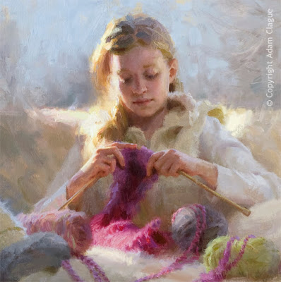
In this painting, notice how the lines of the yarn, seat back, cushions, and other elements lead the eye through the piece. Although the lines take the viewer on a meandering stroll through the picture, they eventually lead back to the center of interest—the girl's face and hands.


Dig Deeper With the
Online Video Course


(Click image to view full-size)
This blog lesson only scratches the surface of composition. In my online video course, I’ve dedicated two entire units to its study! You’ll learn how to draw your viewers from across the room with dynamic compositional techniques.

Access to the course will become available for purchase on October 7, 2019, but you can start the course today for FREE! For more information, please click the button below.

Learn More About Online Video Course

Many people ask me how they can paint more loosely and have more interesting brushwork. Becoming a looser painter was a long journey for me, but in the next lesson, I'll share How This Perfectionist Learned to Paint More Loosely.

See you there!
—Adam

5 Reasons Your Painting Doesn't Look Like Your Subject

 
Isn't it frustrating when you paint and re-paint an area of your picture, only to step back and realize that something still looks "wrong"? Well, when I can't get my painting to look like my subject, it's encouraging to remember that there is a maximum of just 5 things that could possibly be wrong—
  1. Drawing
  2. Value
  3. Edge
  4. Temperature
  5. Color

These are what I call the 5 Fundamentals. Now, I'll share how you can start diagnosing these types of problems in your work.


1. Drawing


"Drawing" is not only a noun; it is also a verb. As a verb, "drawing" is the act of placing the right marks in the right places. Even when I'm painting, I consider myself to also be drawing, because I am still endeavoring to place the right marks in the right places.

How to diagnose: If your painting looks out-of-proportion, "cartoony," leaning or tilted, etc., you have probably made some wrong marks. To learn how to avoid these pitfalls, read The 4 Actions for Correct Proportions.


2. Value


"Value" is how dark or light a shape appears.

How to diagnose: Does your painting look "flat"? You have probably made a value error. Be sure to read Making Your Flat Portraits Look 3-D.


3. Edge


Envision your subject made up of graphic shapes, like mosaic tiles. "Edge" describes the softness or sharpness of the boundary between two tiles.
How to diagnose: If the forms in your painting don't look rounded, or if things look "cut out," you probably have an edge problem. To learn how to paint edges accurately, read Making Your Flat Portraits Look 3-D Part II.


4. Temperature


"Temperature" refers to how "warm" or "cool" a color appears.

How to diagnose: Do you struggle with "muddy" or "chalky" color? These are temperature issues. For help in understanding temperature, read Avoiding Muddy & Chalky Skin Tones.


5. Color

 
I'll skip the difficult task of defining color—color is color!

How to diagnose: Color problems are sometimes painfully obvious—like when you can't get your mixture to match the color in your subject!* One of the biggest questions I'm asked by my workshop attendees is, "How do I mix that color?" If you struggle with mixing color, this lesson is for you: My Simple Method for Mixing any Skin Color.

*Disclaimers: You may certainly choose to interpret
your subject non-literally (e.g., monochromatically or
with a limited palette). In cases like these, your mixtures
can deviate from the colors in your subject
without being considered wrong.
And even with literal interpretations, there
is "wiggle room," because color perception
has a degree of subjectivity.


When I can't figure out why my painting doesn't look like my subject, I'm always encouraged to remember that the problem is just 1 or more of these 5 things. I'm not saying that makes things easy, but at least it makes things manageable and learnable!


Dig Deeper With the
Online Video Course!


(Click image to view full-size)
The online video course mines the depths of the 5 Fundamentals and Composition. With 52+ lessons including over 10 hours of videos, I'll show you how I communicate the beauty of portraits and figures from start to finish.

Access to the course will become available for purchase on October 7, 2019, but you can start the course today for FREE! For more information, please click the button below.

Learn More About Online Video Course

Now, there is actually a 6th thing that might be considered "wrong" with a painting. This thing can be subjective, so it's often inappropriate to describe it as "correct" or "wrong," but #6 is composition. Although composition can be subjective, there are principles that can help make a composition more dynamic. I'll share a few of my favorites next time in 4 Principles for Powerful Paintings.

See you then!
Adam

Fun Colors and When to Use Them

What is your favorite "fun" paint color? I'm talking about that paint color you love so much you could almost eat it (please don't!). Maybe it's a unique color that was required by a workshop teacher. Maybe it's a stunning hue you couldn't resist buying at your local art store. It's that beautiful color that sits on your palette, just begging you to use it…

…But you never seem to find the opportunity to use that color. You always search for the color in your subject but you can never find it. How do you know when to use that "fun" color?

This is a good thing to know, because having too many "fun" colors on your palette can hinder you. Here's why:

  • They take up valuable space on your palette for mixing.
     
  • They can make color mixing unnecessarily complicated. Color mixing is easier when you have fewer choices. Don't worry, having fewer choices won't hurt your painting one bit. Even very limited palettes can sufficiently capture the colors in many subjects (See A Limited Palette That Won't Cramp Your Style)

To begin explaining when to use "fun" colors, I'll share which two "fun" colors I added to my palette for these paintings: 


"Aaron" • Oil 10" x 8"

When I saw my brother-in-law wearing this neon green t-shirt, I was like, "You need to wear that for our painting group!" The shirt provided the perfect opportunity to try out a new paint color I had recently acquired—cadmium chartreuse from Gamblin. The color of the shirt was great fun to paint because of its sheer intensity and because of the way it reflected into his jaw and nose.

"Knitter's Gift" (Detail) • Oil • 30" x 30"

One of the most difficult parts of this piece was the section of fuchsia yarn hit by sunlight. The reason it was tough was that it needed to be both light in value and also very intense/saturated in color.
As you may have found, it is very hard to paint something both light and saturated at the same time. This is because the more white paint you add to lighten another color, the less saturated that color becomes. My solution was to thin my paint to a wash. This allowed my color to be lightened by the white canvas underneath without any white paint. My color could be light and intense at the same time.

But I still had a problem. Neither of the reds I typically use—cadmium red medium and permanent alizarin crimson—was the right color. Both reds were warmer reds than the fuchsia yarn. I could have just used one of these reds anyway, but I really wanted to capture the specific color of the yarn. So I added a "fun" color—magenta from Old Holland. It was the perfect color!

So how do you know when to use a "fun" color? You use a "fun" color when the subject calls for it. But here's the best part–you don't have to wait for that to happen! Go ahead and buy those shocking pink flowers. Pick up that bright aqua hat for your favorite model. Whatever your favorite "fun" paint color is, create the perfect opportunity to use it, and explore its potential!


Learn to Paint Dynamic
Portraits & Figures In Oil


(Click image to view full-size)
Choosing the perfect color palette one thing. Creating a compelling painting is quite another! In my online video course, I'll show you how I communicate the beauty of portraits and figures from start to finish.

Access to the course will become available for purchase on October 7, 2019, but you can start the course today for FREE! For more information, please click the button below.

Learn More About Online Video Course

Sometimes, it feels like there are a million things wrong with your painting. I hope it encourages you as much as me to know there is a maximum of only 5 possible things wrong with your painting. I'll share what those are next time, in 5 Reasons Your Painting Doesn't Look Like Your Subject. See you then!

—Adam