Avoiding Muddy & Chalky Skin Colors


It's happened to all of us who have ever attempted to paint a portrait…

You've been painting that cherub of a child. You've been carefully trying to match the colors of that perfect, unblemished skin. You think you've nailed those rosy cheeks, that fair flesh, that sandy blonde hair.

But then you stand back from your work and… wow. Those cheeks are definitely rosy… like the red soil of Arizona. That skin is exactly as fair as chalk dust. And that hair is sandy, alright. Just like… well, sand.


If only you had a chart of color recipes written by some Betty Crocker of the art world that would tell you exactly how to whip up big batches of Satin Skin and Ethereal Epidermis instead of the mud, dirt and chalk currently on your palette.

Fortunately, the cure for muddy and chalky color is not an unobtainable fantasy. In his book Alla Prima: Everything I Know About Painting, master artist Richard Schmid sheds light on this topic…

"'Muddy color'… is simply a color
that is inappropriate in temperature
"
—Richard Schmid

Muddy and chalky color is not so much a color issue as it is a temperature issue. So let's talk temperature...

Temperature Basics


The first thing to understand about temperature is that there is no such thing as "warm" and "cool." There is only "warm-er" and "cool-er." It's relative—a color is only cool-er or warm-er compared to another color.

Therefore, a muddy or chalky color is one that's either too cool or too warm compared to the surrounding colors.

 
Side-Note: A color might also look muddy or chalky
if it's the wrong value. For example, a shape that's too dark on
a portrait will look like just that—a dark smudge on the face.
But given the value is correct, the reason a color looks "muddy"
or "chalky" is that it's either too warm or too cool in comparison
to the surrounding colors.

But of course, this information is useless unless you can make your muddy colors "UN-too-warm" and "UN-too-cool…"  


2 Ways You Can Make A
Color Warmer Or Cooler


1: By Moving Around the
Color Wheel Like a Clock


First, however, here are 2 important things to know: 1) the red-orange-yellow side of the color wheel is considered warmer"than the green-blue-violet side, which is considered cooler. 2) Most consider either bright yellow or yellow-orange the very warmest color. Blue is considered the coolest color (However, there's an exception that I'll mention in a bit…)

Now, imagine you're traveling around this color wheel like the hand of a clock. The closer you move toward the cooler side, the cooler the color will become. The closer you move toward to the warmer side, the warmer the color will become.


2 Examples:
  1. Let's say you're standing on that very warmest color—a bright yellow-orange. You take one step clockwise toward the green. Now, you're standing on a yellow that's tinted with a hint of green. This yellow-green is cooler than the yellow-orange because you've moved closer to the cooler side of the color wheel.
     
  2. This time, start out on violet. Take one step counter-clockwise toward the blue. Now, you're standing on blue-violet, which is cooler than violet because it's closer to blue and because you've moved further away from the warmer side of the color wheel.
The 2nd way you can make a color warmer or cooler is…

2. By Moving Along Imaginary
Spokes of the Color Wheel
 

Earlier, I said blue is considered the coolest color, but I mentioned there's an exception…

It's true, blue is the coolest color of the rainbow.

However, for the painter, there is one other color so icy, it gives blue frostbite—pure white.

This particular color wheel has a narrow ring showing the most saturated form of each color (1):

The farther you travel away from this ring and toward the center of the circle, the more white is added (2).
Adding white will cool any other color—even blue!

Whew, this has been a ton of info! Just 1 last thing—I'd like to share a few quick tips to help apply all of this information.

Quick Tips

  • If your shadows look chalky, you likely have too much white in your mixture.
  • Sometimes you need to move around the color wheel like a clock. Sometimes you need to move across it like a spoke. Often, you need to do both—move diagonally to make a shift in both intensity and color.
  • In general, red is cooler than yellow.
  • If a color looks muddy, check its value first before changing its temperature.
  • Usually, it's only a subtle shift that's required to fix a bad temperature relationship.
  • If you're illustrating a child playing in a mud puddle… by all means, use muddy color.

If you found this lesson valuable, you'll enjoy digging even deeper in the online video course. Access to the course will be available for purchase starting October 7, 2019, but you can start today for FREE! Click the button below for details.

Learn More About Online Video Course

If you're longing for a "color recipe book" like the one I mentioned earlier, I can't help. But in the next lesson, I'll share the next best thing—My Simple Method for Mixing any Skin Color.

How to Make Your Flat Portraits Look 3-D (Part II)

Last week, I left my poor model with very graphic, hard-edged shapes on her face! Today, I'll talk about how to soften the edges between those shapes.

In the previous lesson, I shared how to accurately paint the lit and shadowed regions of the model's face, as well as the mid-tones in-between. These 3 regions of light, dark, and mid-tone can be seen in this first image.

(Note: If you haven't read the previous lesson yet, I recommend you read it first: How to Make Your Flat Portraits Look 3-D (Part I).)

The image below shows my next stage… the hair, scarf, and shirt are painted with just 2 values each–1 value for the lit side, 1 value for the shadowed side ("value" describes how light or dark a color is).


Now, Let's Address All
Those Hard-Edged Shapes


Even at the current stage, things are beginning to look 3-D. However, value alone cannot completely describe form. To do this, Value needs his trusty co-worker Edge.

"Edge" describes the quality of the boundary between two adjacent shapes. Together, value and edge create the illusion of form.

TIP: Don't be tempted to grab your softest brush and obliterate all those unseemly hard edges too quickly. Edges have a delicate hierarchy that must be observed carefully. There are razor-sharp edges, there are softer edges, and there is every other type of edge in-between.


Two Trusty Guides To
Traverse Edgy Terrain


  1.  Identify the very sharpest edge in
    your subject and paint it first

    Painting the very sharpest edge first establishes a
    standard against which you can compare all other edges.

    (In my subject, the sharpest edge happens to be
    the edge between the collar and chest.)
     
  2. Before painting each edge, ask yourself,
    "How
    much softer or sharper is this edge
    than one I've already painted?"


Two Ways to Soften an Edge


Of course, there are many ways to soften an edge, but here are the 2 main methods…
  1. Drag one shape into another with a clean, dry brush
    I softened her hair by dragging its shape into the background and the background into the hair.

  2. Paint a transitional value along an edge you wish to soften
    Look at the narrow, grayish-violet shape along the cheek between the it and shadowed regions. The value of this shape falls in-between the lit and shadowed regions, too.

    Even though I chose not to use additional strokes to soften this shape, our eye automatically "blends" the shape into the adjacent shapes, especially when viewed at a distance.

If you found this lesson valuable, you'll enjoy digging even deeper in the online video course. Access to the course will be available for purchase starting October 7, 2019, but you can start today for FREE! Click the button below for details.

Learn More About Online Video Course

Next week, I'll talk about Avoiding Chalky & Muddy Skin Colors.

Happy painting, everyone!
—Adam

How to Make Your Flat Portraits Look 3-D


Last week, I gave 3 Steps to Starting a Successful Portrait. If you haven't read it yet, I recommend you read it before reading this lesson.

I had an embarrassing moment a few years back.

I had the opportunity to paint for a week with a master artist I really admire. The first day, we painted a young girl outside. She had beautiful sunlight rimming the back of her golden hair and reflecting into her face. The lighting was anything but "flat."

And yet… I managed to make her head look as flat as a pancake.

When the artist saw my problem, he very kindly suggested, "Adam, why don't you paint the darkest dark and lightest light first?"

I couldn't believe my mistake. If there had been one mantra repeated over and over at art school, it was "paint the darkest dark and lightest light first." I had known better. But that didn't change the fact that the artist was absolutely right… I had managed to neglect this important step. And as a result, I had painted the shadows and lights too similarly, and my painting looked flat.

Do you struggle with portraits that look flat? If so, you are not alone–painting the shadows and lights too similarly is one of the most common difficulties.

The first step on the road to making your flat paintings look 3-dimensional is to paint the darkest dark and lightest light very early on.

Step 1:
(Yes, I'll Say it Again)
Paint the Darkest Dark
and the Lightest Light


In the last lesson, I left off with a drawing that looked very similar to this one. But this image also shows the next step. I've painted two very dark shapes under the hair and scarf, and a very light shape on the cheekbone.

These simple shapes represent the very darkest and the very lightest shapes in my subject.

TIP: To establish the widest range of darks and lights in your painting, make the very lightest shape as close to white as possible. Likewise, make the darkest shape as dark as possible.

Step 2:
Create the Illusion of Light…
With Just 2 Shapes


It is usually a good practice to illuminate your subject in a way that gives a definite lit side and shadowed side.

1st Shape: First, look at the shadowed side of your model's head. Envision this shadowed region as one general shape. Then, ask yourself this very important question…

How much lighter is this shape than the very darkest shape?

Paint the shape accordingly. Also, paint the shadowed side of the head as one general shape, and with one average color. You can add the variations inside this shape later. For now, just focus on laying a simple, strong foundation of light and shadow.

TIP: The shadowed side of the head is often much darker
than you might expect—even if the model has fair skin.

2nd Shape: Now, look at the lit side of your model's head. Envision this lit region as one general shape. Ask yourself, How much darker is this shape than the very lightest shape?

Paint the shape accordingly. Also, paint the lit side of the head as one general shape, and with one average color for now.

Already, this portrait is starting to look less flat and more 3-D. But painting the lit and shadowed sides accurately can be very difficult without first painting the very darkest and lightest shapes for comparison.

Step 3:
"Flesh Out" the Form With Halftones
(Pun Intended)


Next, you'll add "halftones" between the first two shapes. Halftones are part of the lit region, but they're darker than the rest of the lit region because their planes angle away from the light a bit more.

Ask yourself, How much lighter and darker are the halftones than the shapes I've already painted?

Answer this question in your mind, and then mix up one average color for the halftones. Paint the halftones as large, general shapes.

If you found this lesson valuable, you'll enjoy digging even deeper in the online video course. Access to the course will be available for purchase starting October 7, 2019, but you can start today for FREE! Click the button below for details.

Learn More About Online Video Course

So far, my portrait above has very hard-edged shapes. I'll talk about how to soften these edges next week in How to Make Your Flat Portraits Look 3-D (Part II).

3 Steps to Starting a Successful Portrait

Golden
Oil • 10" x 8"


Do you dream of painting Rembrandts, but always seem to end up with Picassos? Maybe your past attempts at portrait painting have looked “flat” and formless. Perhaps you had “chalky” or “muddy” skin tones.

If these are familiar struggles for you, I’d like to tell you you’re not alone—My early attempts at painting portraits from life awarded me big, fat “C’s” in art school!

But I also want to share with you that there is light at the end of the tunnel. It is possible to learn how to paint portraits, and I'd like to share how.

The free art lesson below is the first in a series about portrait and figure painting. I'll share these lessons over the next several weeks. Of course, I can’t promise you’ll be painting like Rembrandt by the end of this series, but I will share the foundational info you need as you develop your skills through dedicated practice.

This series of lessons will prepare you to dig even deeper in my online video course. Access to the online video course will be available for purchase starting October 7, 2019. In the meantime, these free art lessons will supplement the course by teaching supporting concepts—please enjoy this gift from me to you!

Your portrait will not end well if it is not started well. So let's get started!


Step 1:
Drawing a Basic
Shape for the Head


Picasso’s rearrangement of facial features was intentional. But if you’re like me, you’d rather place a model’s features in the correct spots. There’s nothing more maddening than spending hours painting an eye, only to realize later you placed it too high—I know. I’ve been there many times!

This business of putting the right shapes in the right places is what I simply call “drawing.” And this type of drawing is the foundation of a representational painting. For this reason, your portrait will only be as strong as the foundation of drawing upon which it is built.

Let's start building!


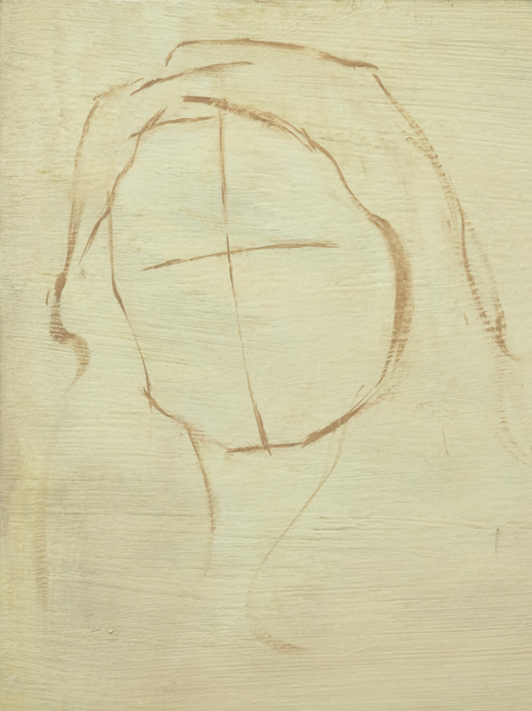
From the front, the head is basically an oval or egg shape. I usually draw the outline of the head with basic angles as shown above.

As you draw this initial shape, look at the subject and ask, “how tall is the head compared to how wide?” Do your best to draw the shape accordingly. Don’t worry if you don’t get it perfect on the first try—you can always modify the shape later as needed.

Tip: Use a charcoal pencil
or a flat brush with a fine edge
to draw with thin, precise lines


Next, draw simple lines for the boundaries of the hair to help you further envision the head. Notice—even though I erased most of the outline of the head underneath the hair, I kept a mark for the very top of her skull. You’ll use this important mark to make a few measurements in the following steps.


Step 2:
Establishing the Tilt and
Rotation of the Model’s Head…
With Just a Single Line


In this case, the model's tilt is very slight. Still, the tilt can be seen when we hold up a brush handle vertically for comparison (right).

Also, note how much her head is rotated side-to-side. Although her eyes are looking right at us, her head is rotated slightly away.


Keeping these bits of info in mind, draw a line down through the center of the face.

Notice my line is slightly curved. Even in this early stage, I’m trying to envision the head as a rounded mass—not flat.

This line establishes the tilt and rotation of the model’s head and helps place the features correctly.


Step 3:
Placing the Eyes, Nose and Mouth…
NON-Picasso-Style


Perpendicular to this line, other lines can be drawn to place the center of the eyes, the base of the nose, and the mouth opening. First, the center of the eyes…

The following 3 rules of proportion are a huge help for drawing accurately:
 
1. The centers of the eyes are halfway between the bottom of the chin and the top of the skull (left).


Left: Once a guide is drawn for the eyes, estimate where the brows should be placed between the eyes and hairline.


2. The base of the nose is about halfway between the brows and the bottom of the chin.

3. The mouth opening is at the top 3rd between the base of the nose and the bottom of the chin.

Tip: The eyes, the base of the nose,
the mouth and the bottom of the chin
should all look parallel to each other.


With just a few marks, you can establish a solid foundation for your painting. If you start with a strong foundation, you will have a much higher chance of ending with a successful portrait.

If you found this lesson valuable, you'll learn even more in the online video course. Access to the course will be available for purchase starting October 7, 2019. However, you can start today for FREE! Click the button below for more details.

Learn More About Online Video Course

Now for the next step: Making Your Flat Portraits Look 3-D.


Art of the Portrait Conference

Us (right) with TJ and Julie Cunningham, our
friends from PCC. TJ won Fifth Place this year!
Andrea and I had an amazing weekend at our first Portrait Society of America "Art of the Portrait" Conference! The conference faculty members are some of the most highly skilled painters in the fine art industry. Attendees glean from their experience as they lecture and demonstrate during the four-day event. The conference culminates in the Awards Gala Banquet, where the winners of International Portrait Competition are announced. This year, the annual conference was held in Reston, VA, outside Washington DC.


Face-Off
Activities commenced with the annual Face-Off event. Fifteen faculty members painted portraits from life for the roughly 750 attendees. See all the face-off portraits at Underpaintings Blog.


Face-Off Demo by Jeff Hein


Faculty Demos
Throughout the conference, faculty artists shared their knowledge through informative demonstrations. On several occasions, James Gurney set up off-stage and painted these artists as they demoed (see video below).


In-progress demos by Jeff Hein (left) and Quang Ho

In-progress demo by Mary Whyte

In-progress demos by Robert Liberace (left) and Rose Frantzen


Recreational Painting
TJ had the great idea to do some portrait painting in the host hotel's lobby. Why not! At first, it was just us. Then little by little, more artists joined in until we had quite a crowd.

Tim and I painting artist Isaiah Hoppe


A crowd gathers!


Gold Medal Award for Lifetime Achievement
This year's award went to master artist Joe Bowler. Because he is handicapped, he was not able to attend the conference. His former protégé Brian Neher presented his award while conference attendees watched via the Internet. Bowler's recognition was meaningful to Andrea and me because Bowler's portraits of our college's president and his wife provided continual instruction and inspiration while we pursued our art studies. You can view Bowler's work at his website here.


Congrats to the finalists!
Click names to visit artists' websites • Click here to view finalists' paintings 

William Draper Grand Prize
A Father's Dreams and a Son's Love

By Bryce Billings
Draper Grand Prize & People's Choice: Bryce Billings
1st Place Painting: Tony Pro
1st Place Sculpture: Alicia Ponzio
2nd Place: Jeff Hein
3rd Place: Kelly Carmody
4rth Place: Aron Belka
5th Place: TJ Cunningham
1st Honor Award: Seth Haverkamp
2nd Honor Award: Adam Clague
3rd Honor Award: Olga Krimon
Certificates of Excellence: Paul Batch, Aimee Erickson, Gavin Glakas, Kristy Gordon, Barbara Kiwak, Sandra Kuck, Clement Kwan, Ricky Mujica, Aapo Pukk, James Tennison, Wesley Wofford


Knitter's Gift
Oil on linen • 30"x30" • Available 6/7/14 at the OPA National
(To inquire, contact the Bennington Center for the Arts)
I praise God for allowing me to win the 2nd Honor Award for my painting, Knitter's Gift! I am so humbled and honored.

Andrea and I had a blast at the conference, and are looking forward to attending the conference next year in Atlanta!


Be the first to see our latest paintings

Subscribe to Our Latest Artwork & Adventures email newsletter below to see our new work before the general public. If a painting catches your eye, you'll have first dibs on purchasing.


Painting Siblings

No, this isn't a post about double portraits. It's actually about two paintings that are, in a way, "siblings."

Steering Home
Oil on linen • 6"x6" • Sold
Prayers For His Voyage
Oil on linen • 6"x6" • Sold


In 2010, while visiting relatives, I painted a still life of objects I collected from my grandmother and aunt ("Prayers For His Voyage," above). The painting represents a woman praying for a loved one who is abroad (perhaps at sea or war). The Bible represents her faith, and the candle symbolizes her hope.

I sold the piece recently, and it was not long before the client presented me with a brilliant idea—perhaps I could create a companion painting that depicts the story from the man's point of view. "What a great idea!" I thought, and soon began setting my mind to the task. I used some of the same symbolism from the first painting, including a candle for the man's hope and a Bible for his faith. I depicted the man as a sailor, steering towards the light and nearer to his loved one, who is pictured in a locket. The rocks represent his ever-present dangers, against which her prayers protect.

These two paintings now hang side-by-side. Each shares a side of the tale, and together, they tell the full story.

Be the first to see our latest paintings

Subscribe to Our Latest Artwork & Adventures email newsletter below to see our new work before the general public. If a painting catches your eye, you'll have first dibs on purchasing.


My Favorite Thing to Paint

Dan (by Andrea)
Oil on linen panel • 10"x8" • Available
(To inquire, email artsy_orrnge@yahoo.com)
While Andrea and I studied at Pensacola Christian College, our all-time favorite art course was Figure Painting with artist-in-residence Brian Jekel (view his work here). The class met for two hours each Tuesday evening to paint a clothed model from life. Each model would pose for two consecutive weeks, and we were not permitted to work on our paintings outside of class. The limited time-frame and complex subject was a unique challenge I found exhilarating. Soon, creating portraits from life became my favorite painting activity. In fact, I loved it so much, I elected to take the class three times!

After Andrea and I graduated, we greatly missed painting people from life as often. When we moved to Missouri, we dreamed of one day opening our studio for group life-painting sessions. Thanks to my industrious mother, who almost single-handedly prepared our studio, we were able to host our first session last September. We've been meeting every Thursday night since, and the response has been wonderful. It has been a joy to paint people from life again and to meet such great new friends.

Our sessions are open to all Kansas City area artists. If you would be interested in joining us, please visit our Facebook Group here and click "Join Group." Click the "Events" tab to see a list of upcoming sessions, then select the one you'd like to attend. If there are 10 or fewer people coming (our comfortable max), click "Going." Please send me a private message on Facebook for directions to our studio. We ask everyone to bring a portable easel, supplies and $6 for the model. We look forward to seeing you!


Our Painting Group


Just a few of our painting buddies
(Click their names to visit their websites)

L to R: Crystal Manning, Wanda Greene,
Polly Plain (back), Eileen McCoy,
Andrea, me, Ryan Delgado, Peggy Wilson


A Few of Our Thursday Night Paintings

(Many more paintings and photos from our sessions can frequently be found
at Peggy Wilson's blog and Greenverdugo Art's Facebook page.)


Daniel (by Andrea)
Oil on linen • 12"x9" • Available
(To inquire, email artsy_orrnge@yahoo.com)

Micah (by Adam)
Oil on gesso panel • 12"x9" • Available
(To inquire, email Contact@AdamClague.com)

Judy (by Adam)
Oil on gesso panel • 12"x12" • Sold

Matthias (by Adam)
Oil on gesso panel • 12"x12" • Sold

Bo (by Adam)
Oil on gesso panel • 16"x12" •
In a private collection

Be the first to see our latest paintings

Subscribe to Our Latest Artwork & Adventures email newsletter below to see our new work before the general public. If a painting catches your eye, you'll have first dibs on purchasing.