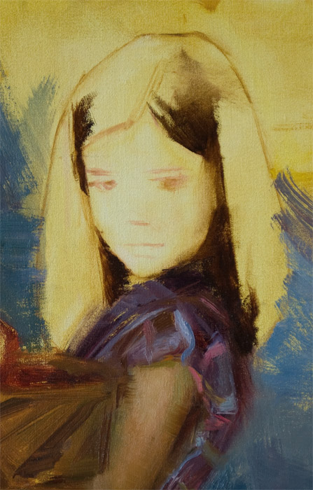
Painting Demo: Stage 7

I hope everyone had a marvelous Valentine's Day! For those of you that checked the blog for new material yesterday, I apologize. I took the day off to spend time with my wonderful girlfriend Andrea Orr. Today, I'd like to show the progress I've made on Sydney's head.

I started by massing-in the darkest values. When starting a new area of a painting, it's a good idea to establish your darkest values first (or the lightest ones). That way, you have a standard against which to gauge all the other values. You can then ask yourself, "how much lighter is this new value than my darkest value?" and so-on.

At this stage, you'll notice a lot of my strokes have sharp edges. These will get softened later. At this point, my priority is to establish a strong value pattern (arrangement of darks and lights). When painting a head, I remember the "egg principle": Just like an egg, one plane of the human head will be lighter than all the other planes. The lightest plane on any object will be the plane angled closest to a 90-degree angle to the light source. Usually, the lightest plane of the human head is the forehead. However, because of how Sydney is positioned in front of the window, the lightest values happen to occur on her cheeks. I like it, so I'm going to go for it!


And here's what I have so far. Not a finished head, but it's getting there! In the coming days I'll be working on the drawing of her mouth (I want to make her smiling a bit more) and on freshening up my brushwork. This may not happen tomorrow, in case you're wondering. We'll just have to see which area of the canvas I feel like painting in the morning!

Thanks for joining me again! I hope to see you back tomorrow, Wednesday the 16th for more!

Painting Demo: Stage 6

Happy Friday everyone! To jumpstart your glorious weekend, how 'bout a painting demo? Yeah, I thought it was a good idea. Fasten your safety belts, everyone. It's... Stage 6!

As you can see, I am covering my canvas in a systematic fashion, working from the boy outward. Many times, I have a more "A.D.D." approach, jumping from spot to spot until the painting is completed (Let's see... what were we talking about? Oh yeah, painting!). I am trying to emulate the wooden textures of the chair and desk by applying my paint more roughly. Also, I can scrape off paint with my palette knife to suggest that the wood is worn.


Next, I started blocking-in Sydney's skirt. I am trying to make it darker at the bottom and lighter at the top to suggest light falloff. It can be difficult to paint patterned fabrics because they tend to dominate. It is the artist's challenge to keep the pattern "quiet" while still maintaining accuracy. The picture of the skirt below is in progress.


I'm having lots of fun with those violet hues under the cool light! The arm and upper part of the dress are nearly finished here. The hand and basket are still in the block-in stage.


Looking at the full canvas, you'll notice I made Sydney's flesh tones darker than Jackson's. I did this to give the illusion that Sydney is set further back from Jackson. Also, by keeping my lightest tones on Jackson and his shirt, I can establish him as my main focal point.


Yes folks, I now have a headless girl on my canvas. Looks like I also made her hand too large. Poor Sydney! Don't worry everyone, I'll have her back to her normal self shortly!

I tried to post a lot this time since I may not be able to post much (or anything) on Monday because of Valentine's Day. Plus, I know none of you love-birds will want to read a boring painting demo on the holiday anyway! So... see you back on Tuesday, the 15th for Stage 7! For those of you single people out there, I may post a small offering on Monday, but no promises!

Painting Demo: Stage 5

I want to say a hearty "thank you" to all of you who have been following this demo thus far! I'm looking forward to seeing how my painting will turn out and I hope you are too!

Painting Progress

After establishing the drawing (Stage 4), I began to fill in my outlines with the correct shapes and colors. Below is the sneak peek image from Stage 1 (Don't worry, I'll show other pictures too). Don't forget, you can click on any image to view it larger.


The hand in the above picture is an example of how I "block-in" or "mass-in" an area before painting it more fully. Notice how the hand is simplified down to just one flat color for each major plane. This helps me establish a strong structural foundation before laying the details on top.

Here is the finished hand with the second hand blocked-in. I also worked on the shirt, desk and book (sorry, the colors in this photo look a bit dingy).


Top hand complete,
bottom hand in progress

And here's a closeup of the hands that shows my brushwork.


So, I admit I'm at a bit of a loss as to what to discuss in this particular post ("Yep, there's the hands all right... sure tried tuh paint 'em real good... hope ya like 'em..."). But one of my most faithful followers suggested that perhaps some of you would be interested in hearing about my current palette.

My Palette


I said my "current" palette because it varies every now and then. Right now, I'm using a full color palette, which I'll outline below. If you are a beginning painter, I suggest using the palette of Anders Zorn, which consisted of ivory black, white, yellow ochre and either vermilion or cadmium red medium/light. It may seem like such a limited palette would be very difficult to use. However, the Zorn palette is best for beginners because it forces the painter to think in terms of temperatures rather than colors. If you are just on the verge of graduating to a full color palette, I suggest you limit yourself to two of each primary (a warm and a cool version of each), an earth tone (like burnt sienna) and white.

Here's what I have on my palette right now. Yes, I use Winsor & Newton's student grade pigments (Winton) for some of my colors. But I still have a lot of the stuff left over from school, and I'm trying to use it up and not be wasteful.

Cadmium yellow pale hue (Winton)
Yellow ochre (Utrecht)
Cadmium orange hue (Winton)
Cadmium red hue (Winton)
Alizarin crimson (Winsor & Newton)
Transparent oxide red (Rembrandt)
Cerulean (Utrecht)
Cobalt blue light (Rembrandt)
Ultramarine blue deep (Rembrandt)
[Yes, three blues. I know, I'm crazy]
Sap green (Rembrandt)
Viridian (Rembrandt)
Titanium white (Utrecht)

For Sydney's purple dress, I might pull out my Old-Holland tube of cobalt violet dark. I rarely use it because it's my most expensive pigment! And I do so love keeping things inexpensive (hence my Winton pigments).

And there ya have it! Oh, and I use Viva brand paper towels.

OK, now I know all of you are just on the edge of your chairs in eagerness to ask questions or comment on this demo, so let me get the ball rolling. Has anyone decided yet what the story is that I'm trying to tell with this picture? If you have time, let me know by commenting at the bottom of this post or on Facebook. Any comments, questions or suggestions are welcome! By the way, I also need a title for this piece. Any ideas?

Thanks everyone, and have a great night! Be sure to return tomorrow, Friday the 11th for Stage 6!

Painting Demo: Stage 4

Drawing

I know you're thinking, "drawing? I thought you said it was all painting from here on out! I want my money back!" I did say I would be painting from here on out, but this is drawing with paint. And this demo is free, by the way. It is a common misconception that "drawing" is a term used only for black-and-white media such as charcoal or graphite. But "drawing" can also be defined as "the accurate placement of shapes," regardless of what medium an artist is using. When I first approach a canvas, I do not simply start flinging paint around. I must first determine precisely where to fling it.

In order to place the correct shapes in the right spots on my canvas, I use a measuring or "sighting" system. I do not use numerical measurements, but rather comparisons. It's kind of like those "connect the dots" exercises from when you were a kid. I imagine my subject covered with dots. Then I compare the distances between those dots. For instance, I might find that the distance between "dot A" and "dot B" fits 2 1/2 times into the distance between "dot C" and "dot D." Then I make sure to establish that same relationship on my canvas. The "ruler" I use to measure is my brush handle. By sliding my thumb up or down my brush handle, I mark off a length that matches the distance between two dots. Then I can compare that distance to the length between two other points. I keep measuring and comparing until I find where all those points go on my canvas. Then it's as simple as "connect the dots"!


Drawing Stage
(Sydney drawn too large)
Still confused? Don't worry, the above was my attempt to cram a whole week of college drawing instruction into one paragraph. Besides, I get mixed up too sometimes. Take the image to the right, for example. I drew Sydney too large and realized I would not have room on the canvas for her hands and basket of apples. I had to wipe it off and draw her again. But hey, that's life!

Here's the corrected version:
Drawing Stage


I wanted to show two approaches to drawing. You'll notice my drawing of Sydney is much simpler than the one of Jackson. An artist's drawing can be as simple or as detailed as he wishes, as long as he is able to establish an accurate foundation upon which to lay his final paint (to paraphrase the words of my painting instructor Mr. Jekel).

Drawing: Simple approach
Drawing: More detailed approach


Well, I kept this stage shorter for those of you that may have been overwhelmed by yesterday's epic post. Tune in tomorrow, Thursday the 10th, for more fun with Adam!

Painting Demo: Stage 3

Before I get started today, I must address a subject that a follower wished I had discussed in Stage 2--the lighting. I had been to Sydney and Jackson's house several times before I realized, with much excitement, that the huge window in their living room was north-facing! Why, might you ask, was I excited about this? Because for many artists including myself, north light is the preferred light source. This is for a couple reasons:

1) Windows facing other directions will allow direct sunlight to come through at various times of the day. There is nothing wrong with painting a subject under direct sunlight, but it can be difficult, since the artist must work quickly to capture his subject before the sun moves too much or hides behind a cloud. North-facing windows provide consistent light all day long. The brightness of north light may change due to cloud coverings, but the temperature will remain the same (cool light and warm shadows).

2) All types of natural light are beautiful, but north light can be especially picturesque. It provides a natural balance of color that creates gorgeous color harmonies in a subject. Also, it is highly diffused, producing soft, delicate shadows that are especially ideal for portraits (direct sunlight can cast hard, unsightly shadows across a person's face).

It was a blessing that Sydney and Jackson's north window was large enough to cast its light not only on my models, but also on my canvas and palette. OK... now time for Stage 3!

Digital Value Study

Digital Value Study
I know there are some purist painters viewing this demo that are shocked that I would trade the tradition of brush and canvas for digital stylus and tablet. But I view the digital medium as simply another tool in my belt. Never fear, I am an oil painter at heart and probably always will be. Still, I sometimes make a preliminary study on my computer, since it allows me to alter my image more quickly and easily than any other medium. In short, it's a huge time-saver. And before jumping into the painting for this demo, I realized I needed to fully establish my composition's value pattern and eye-flow, since my preliminary sketch left these elements somewhat unresolved (check Stage 1). Comparing this study to my preliminary sketch, you'll notice I "quieted" the bookshelf in the background by darkening and softening it. Now it fulfills its purpose of adding realism to the setting, but without distracting from the figures.

I rendered Sydney's face more completely than the rest of the study to make myself feel better about showing such a rough sketch publicly!


My Composition Analyzed

Because of its somewhat-subjective nature, the concept of composition is a difficult one to discuss. Many compositional decisions are made simply through the intuition of what "feels right." There are, however, some basic "tricks" that can help the artist make the viewer's eye go where he wants it to go. I won't reveal all my secrets right now, only a few that I utilized for this piece.

Figure "A" reveals a large pathway through the piece. It acts as a road, down which the eyes are naturally drawn (as shown by the dotted line). Along the path are my main centers of interest, the two faces.

Figure A

Figure "B" shows some lines that point back to the main pathway, just in case people try to go a-wandrin'. Stay on the path!

Figure B


Figure "C" displays two circuits that are naturally formed by the kids' poses. These act as refreshing oases for the eyes to park at as they make their journey along the main path.

Figure C


Toned canvas (22" x 30")

Tone (A.K.A. "Underpainting")

Well, I promised you I would show you some actual painting on my final canvas, didn't I? I usually start a painting by applying a tone over my canvas. I know what you're wondering--"Why on earth did you paint your entire canvas bright yellow-orange?" Believe it or not, there is a purpose to my choice. I am planning to have an overall blue-violet color harmony in this piece. Blue-violet and yellow-orange are complements (on opposite sides of the color wheel). When an artist juxtaposes two complementary colors side by side, it produces a dazzling effect to the eye that cannot be produced by simply mixing the two colors together. By only partially covering my underpainting when laying down my blue-violet colors, I hope to produce such an effect. We shall see!

OK, that's enough for today. And in case any of you are bored to death of hearing about my preliminary process, don't worry--its all painting from here on out! Be sure to come back tomorrow, Wednesday the 9th, to see the next phase!

Painting Demo: Stage 2

Welcome back! Today I'd like to begin by talking about my inspiration for this painting. As I mentioned on Friday, this piece started as a mental picture--but you may be wondering what inspired that image in the first place. For me, inspiration comes from a variety of sources: a particular lighting situation, a personal experience or maybe a beautiful aspect of God's creation, to name a few. My motivation for this piece, however, came from my two friends Sydney and Jackson. These are two of the most charming, good-natured and well-behaved kids I have known. I just knew they would make perfect models! In real life, Sydney and Jackson are siblings, but the characters in my composition are not necessarily related.

Life Painting Session

Painting from life is very important to artists because it allows us to copy colors and tones that a camera cannot capture. If possible, I work entirely from life. However, some subjects like leaping horses, moving vehicles and children (even the best-behaved ones) are impossible to paint completely from life. In such cases, I paint from photos. Though if at all possible, I still strive to spend at least a bit of time observing and painting my subject from life. I'll do this on a smaller canvas like the 8" x10"'s shown below. The goal of the life painting session is not to capture a person's likeness but to document the accurate tones, temperatures and colors that a camera would fail to record. By capturing this vital information in paint, I have an accurate guide by which to judge my colors and tones while painting the final piece from photos.

Sydney and Jackson were very agreeable to pose for me to paint them, and I tried to be as accommodating as possible. I painted them separately, limited the time to one hour each and encouraged breaks. I also let them watch movies on a laptop while posing.

One-Hour Life Sketch • Oil • 8" x 10"


Photo Shoot

Before the the life painting sessions, I made sure to take plenty of photos of the kids in their poses. I never wait until the end of a session to photograph models, because by that time they always look tired. Posing is hard work! Of course, Jackson is supposed to look tired, so I guess it wouldn't have mattered for him!


Jackson Photo Reference

Sydney Photo Reference
Thanks for joining me! Check back tomorrow, Tuesday the 8th, to see my digital value study (yes, I said "digital") and... drum roll please... some actual painting on my final canvas! Can you believe it? And if you missed Stage 1 of this demo, be sure to scroll down to the previous post.

Painting Demo: Stage 1

Sneak Peek: Head in progress
Thank you for stopping by! Today I am starting my first painting demonstration for this blog. My goal is to provide a behind-the-scenes look at my work. I hope it will be interesting to artists and non-artists alike!

The process outlined in this demo is neither the perfect process nor the only one a painter might use. It is not even the method I use 100% of the time. But it's the one I employ for more involved compositions like the one in this demo, since it includes preliminary steps I find important for complex pieces.

As with any painting, I don't know how this piece will turn out in the end, nor can I predict the bumps that might occur along the way. But that's part of the adventure! I hope you will enjoy each step as I post a new stage each weekday until the painting is complete.

As I always do when I work, I pray that the Lord will bless this painting and enable me to do well for His glory.

Preliminary Sketch

Preliminary Sketch • Graphite • 4" x 5"
Almost all of my figurative paintings begin as mental pictures. Eventually, my eyeballs get jealous of my mind's eyes, and I am forced to transfer my thoughts to paper. The result is a variety of thumbnail sketches like the one pictured. These drawings help me begin to establish the rhythm (the placement of lines that control the viewer's eye-flow) and value pattern (the arrangement of dark and light shapes). The background elements are unfinished in this sketch because I felt they were distracting from my figures. Yet, in order to make the environment more believable, I needed them. Eventually, this conundrum got the best of me, so I decided to address it later (usually not a good idea).

There is a story I wish to tell with this picture. And even in this preliminary sketch, I tried to make that story clear. If my concept is not clearly communicated in the preliminary stages, I cannot hope that it will be in the end. So, based on this preliminary sketch, how am I doing? What is the boy doing, and how does he feel about it? What is the girl about to do? Why might she be doing it? Where are these children? The first two questions must be answered clearly by my painting, but the last two can be left up to the viewer's interpretation.

Please join me on Monday, Feb 7 for my photo shoot and life-painting sessions!