What is your favorite "fun" paint color? I'm talking about that paint
color you love so much you could almost eat it (please don't!). Maybe
it's a unique color that was required by a workshop teacher. Maybe it's a
stunning hue you couldn't resist buying at your local art store. It's
that beautiful color that sits on your palette, just begging you to use
it…
…But you never seem to find the opportunity to use that color. You always search for the color in your subject but you can never find it. How do you know when to use that "fun" color?
This is a good thing to know, because having too many "fun" colors on your palette can hinder you. Here's why:
…But you never seem to find the opportunity to use that color. You always search for the color in your subject but you can never find it. How do you know when to use that "fun" color?
This is a good thing to know, because having too many "fun" colors on your palette can hinder you. Here's why:
- They take up valuable space on your palette for mixing.
- They can make color mixing unnecessarily complicated. Color mixing is easier when you have fewer choices. Don't worry, having fewer choices won't hurt your painting one bit. Even very limited palettes can sufficiently capture the colors in many subjects (See A Limited Palette That Won't Cramp Your Style)
To begin explaining when to use "fun" colors, I'll share which two "fun" colors I added to my palette for these paintings:
|
 |
| "Aaron" • Oil • 10" x 8" |
When I saw my brother-in-law wearing this neon green t-shirt, I was like,
"You need to wear that for our painting group!" The shirt
provided the perfect opportunity to try out a new paint color I had
recently acquired—cadmium chartreuse from Gamblin. The
color of the shirt was great fun to paint because of its sheer intensity
and because of the way it reflected into his jaw and nose.
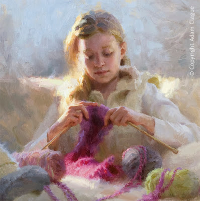
One of the most difficult parts of this piece was the section of fuchsia yarn hit by sunlight. The reason it was tough was that it needed to be both light in value and also very intense/saturated in color.
As you may have found, it is very hard to paint something both light and
saturated at the same time. This is because the more white paint you
add to lighten another color, the less saturated that color becomes. My
solution was to thin my paint to a wash. This allowed my color to be
lightened by the white canvas underneath without any white paint. My
color could be light and intense at the same time. |
| "Knitter's Gift" (Detail) • Oil • 30" x 30" |
One of the most difficult parts of this piece was the section of fuchsia yarn hit by sunlight. The reason it was tough was that it needed to be both light in value and also very intense/saturated in color.
But I still had a problem. Neither of the reds I typically use—cadmium red medium and permanent alizarin crimson—was the right color. Both reds were warmer reds than the fuchsia yarn. I could have just used one of these reds anyway, but I really wanted to capture the specific color of the yarn. So I added a "fun" color—magenta from Old Holland. It was the perfect color!
So how do you know when to use a "fun" color? You use a "fun" color when the subject calls for it. But here's the best part–you don't have to wait for that to happen! Go ahead and buy those shocking pink flowers. Pick up that bright aqua hat for your favorite model. Whatever your favorite "fun" paint color is, create the perfect opportunity to use it, and explore its potential!
Learn to Paint Dynamic
Portraits & Figures In Oil
(Click image to view full-size)
Choosing the perfect color palette one thing. Creating a compelling painting is quite another! In my online video course, I'll show you how I communicate the beauty of portraits and figures from start to finish.
Access to the course will become available for purchase on October 7, 2019, but you can start the course today for FREE! For more information, please click the button below.
|
Sometimes, it feels like there are a million things wrong with your painting. I hope it encourages you as much as me to know there is a maximum of only 5 possible things wrong with your painting. I'll share what those are next time, in 5 Reasons Your Painting Doesn't Look Like Your Subject. See you then!
—Adam


Thanks a lot for sharing such inspirational site that diverts our mind and we keep watching and reading all information provided.
ReplyDelete